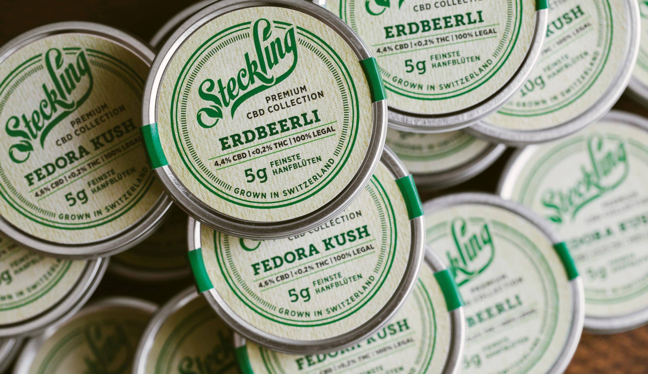
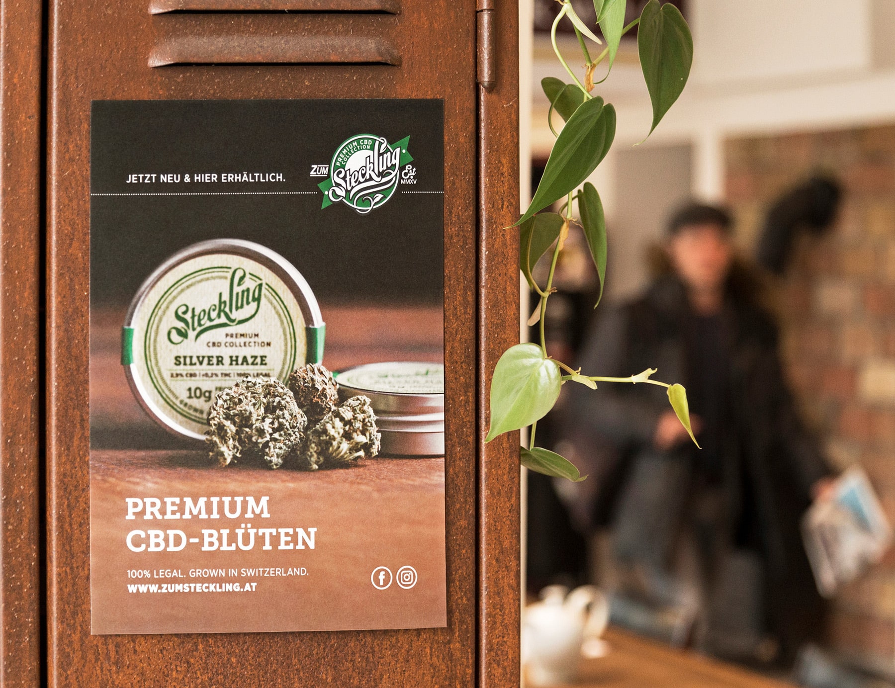
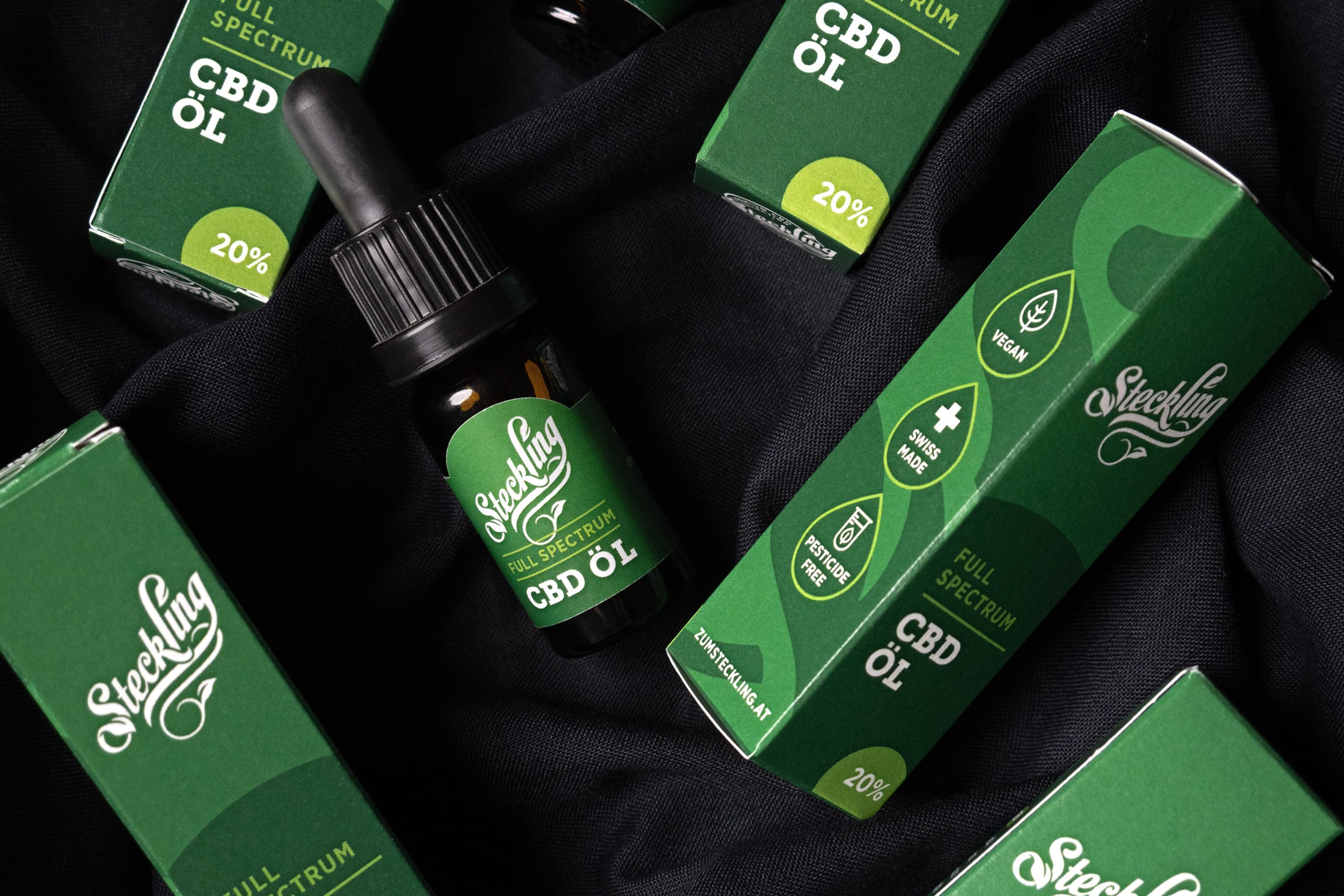
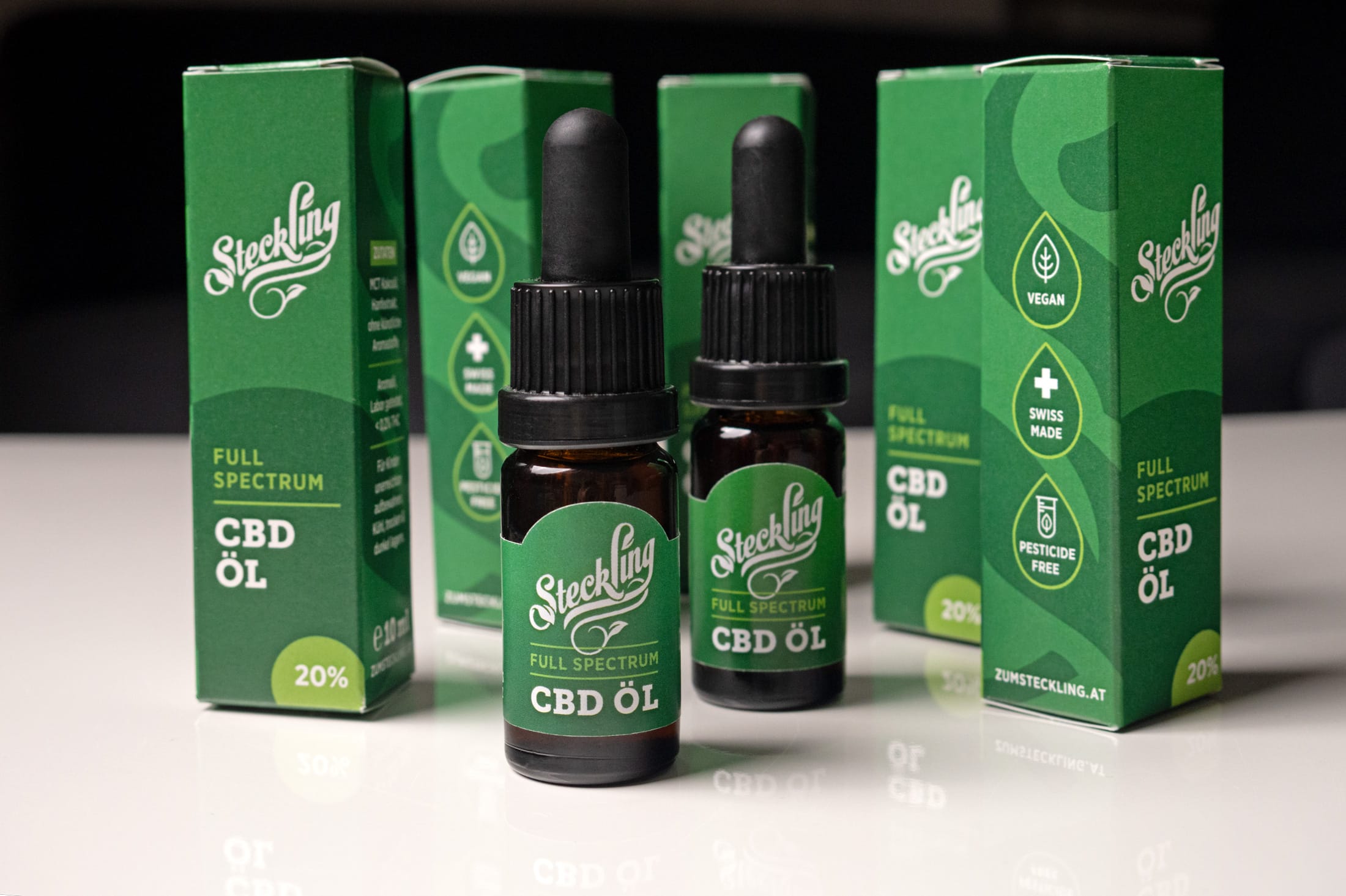
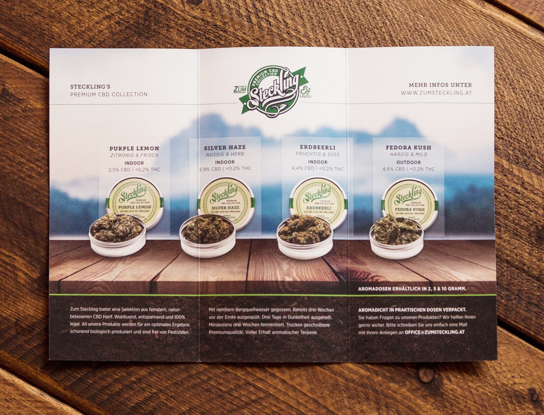
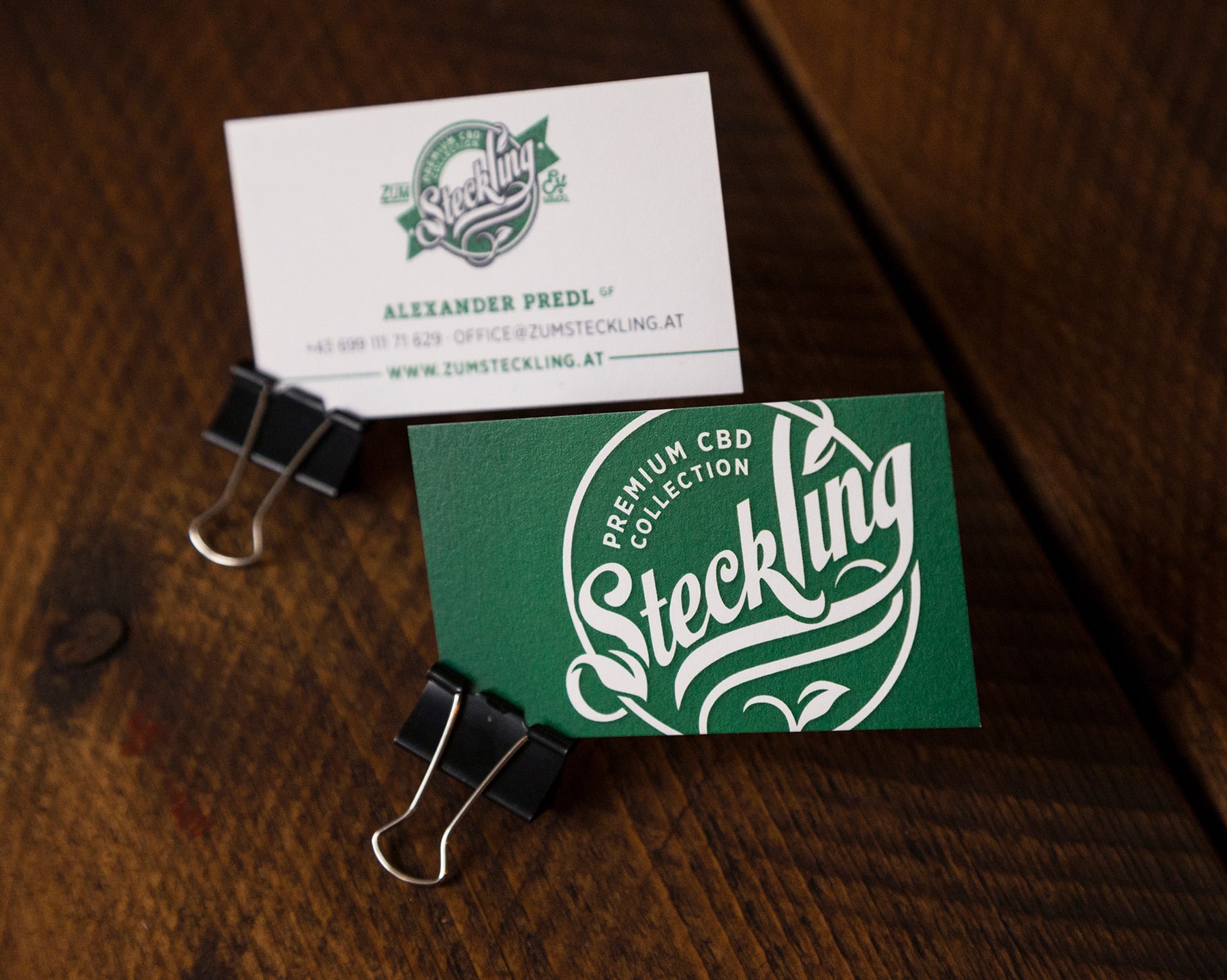
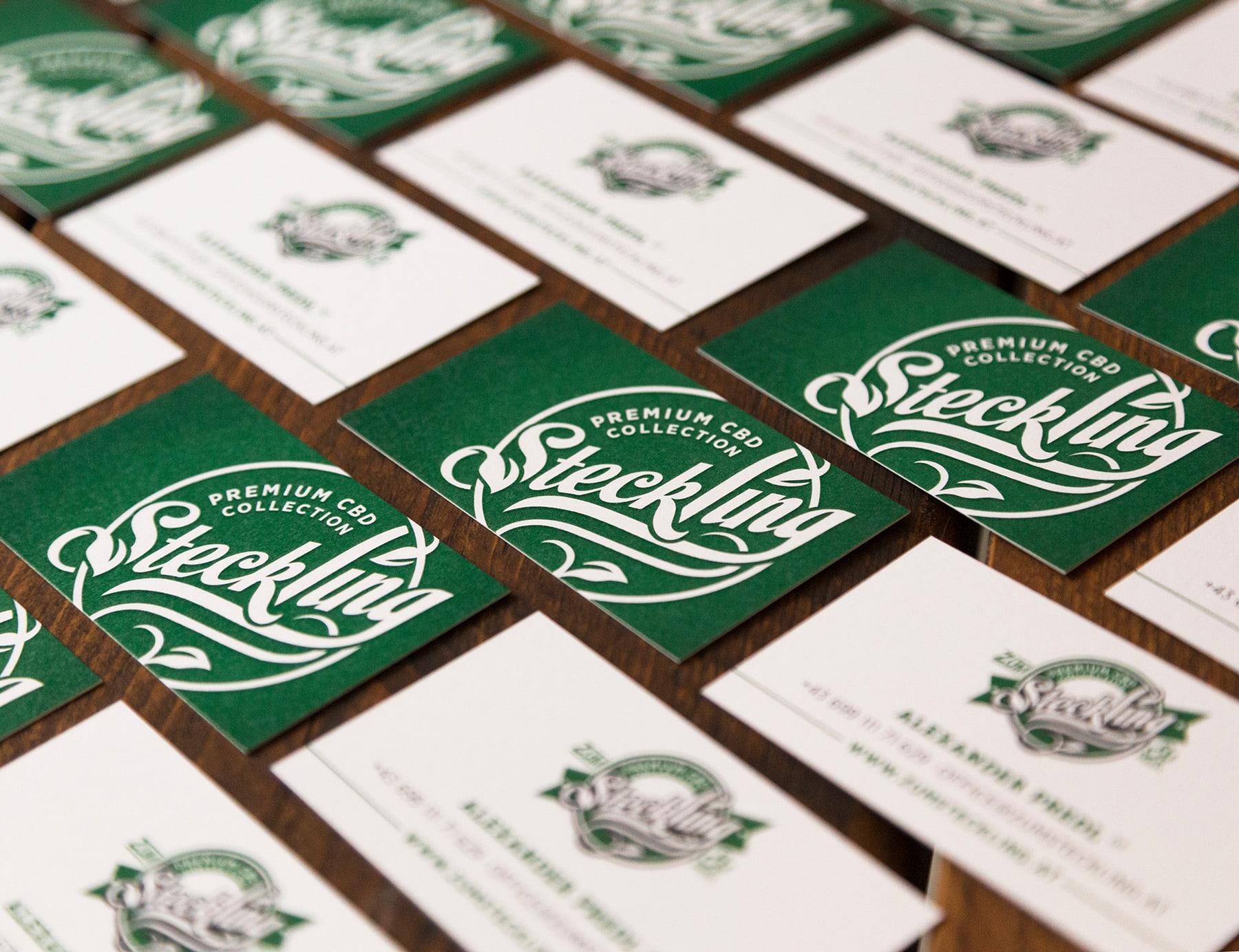
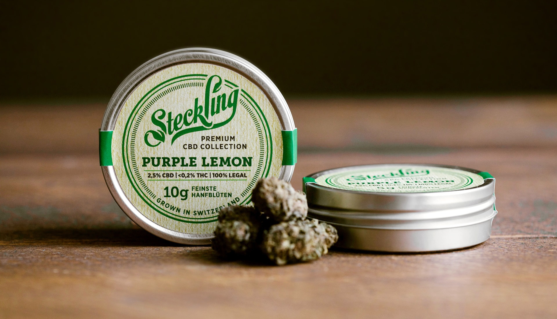
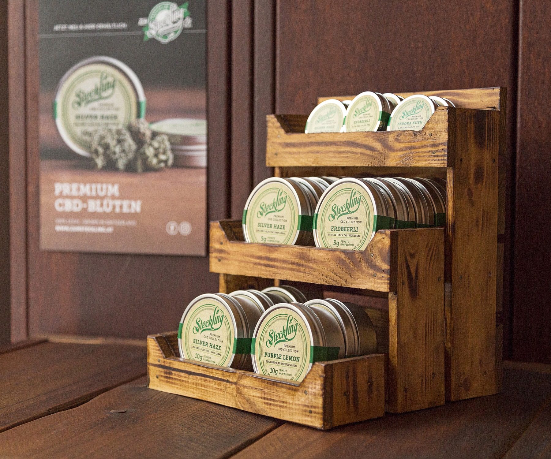
For the premium CBD brand Zum Steckling, we created a cohesive visual identity spanning from corporate design to packaging. The result is a nature-driven, pure, and grounded aesthetic tailored to the German-speaking market, with a strong focus on sustainable packaging materials. Through organic textures and a calm, earthy color palette, the design communicates authenticity, quality, and trust—positioning Zum Steckling as a sincere and reliable brand in the premium CBD segment.